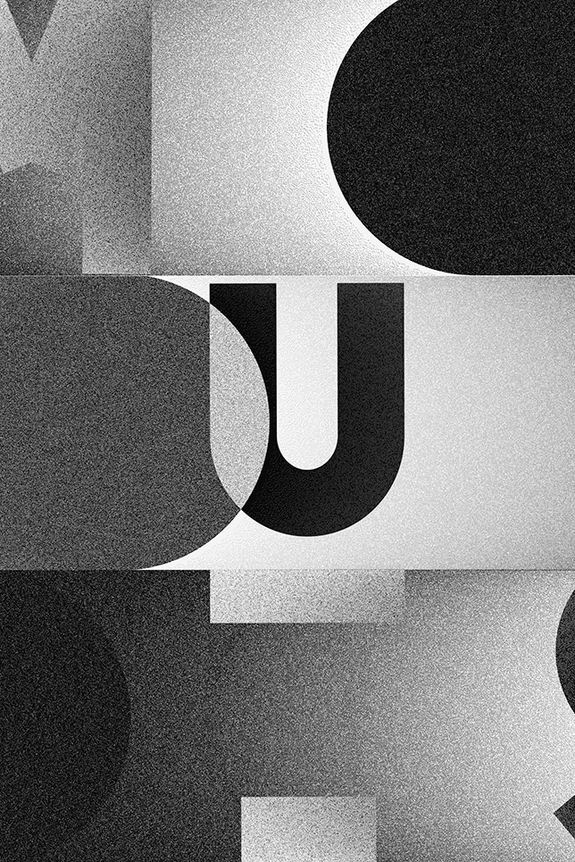
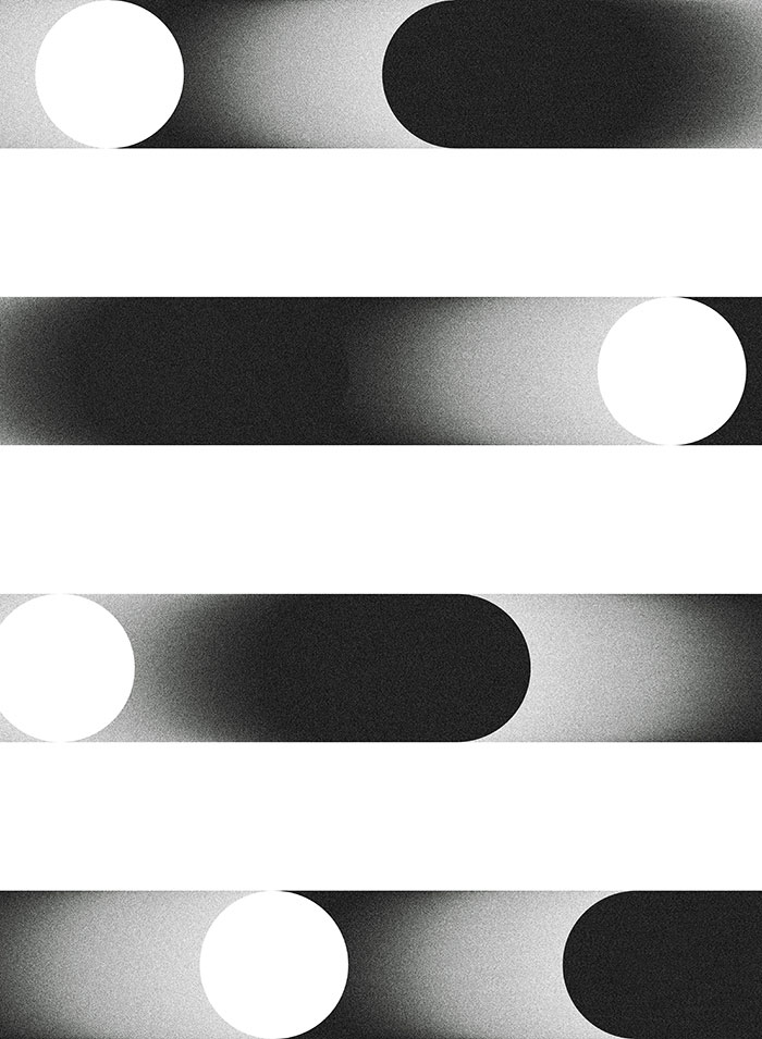
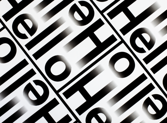
Le Graphiquants editorial design: I was drawn to the simplistic use of rounded shapes paired with subtle monochrome textures. I really like the gradients and ranges of tones in these works, something I see working well in my personal branding.


I was excited here by the nice combination of a contemporary sans serif with bold representations of the moon. I used a a sans serif typeface throughout my self branding last year because I feel they compliment and contrast well with my current visual style which is abstract, expressionate and sometimes a bit messy.


No comments:
Post a Comment