Monday 29 February 2016

OUGD502 - Brief 01 - Martin Parr @ The Hepworth Wakefield

I went to the opening night of the major Martin Parr exhibition at the Hepworth Gallery in Wakfield. The atmosphere on the night was great, there was a real mix of people there and it was really exciting to see the artist himself engaging and interacting with his followers. The exhibition is significant as it features an outstanding number of original photographic prints spanning 40 years of Parr's creative career.

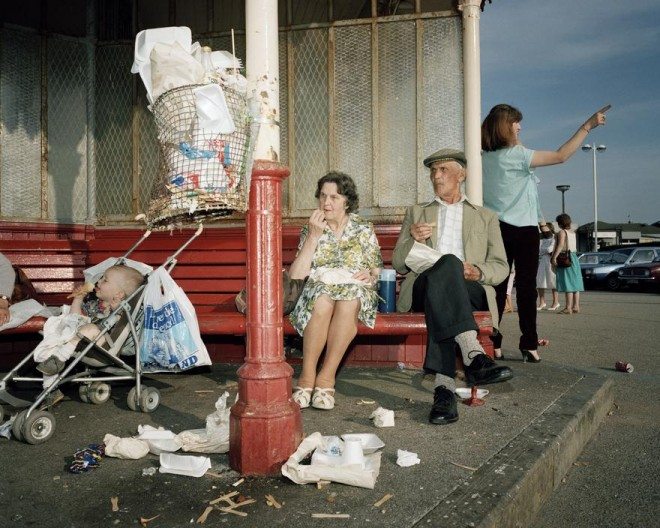
The Rhubarb Triangle & Other Stories is the largest Martin Parr exhibition in the UK since his Barbican retrospective in 2002, comprising more than 300 photographs that cover the past 40 years. 

A comprehensive overview of Parr’s work is on display, from early Yorkshire-based black and white photographs of rural communities to his recent international examinations of consumerism. Drawing on the implicit themes of labour and leisure present in the new Rhubarb Triangle commission, the exhibition brings together photographs from multiple series and commissions to address contemporary global networks of industry and consumption. Key series include:The Non-Conformists, 1975-80; The Last Resort, 1983-85; The Cost of Living, 1989;Autoportrait, 1991-2012 and Common Sense, 1995-99.


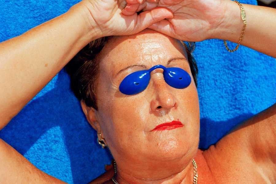
Parr's investigation of cultural identity, aspiration and image is further addressed in the Autoportrait series, within which Parr presents himself as subject of studio portraits around the world. His increasing international work, photographing around the world for commissions or his own projects on themes such as tourism and beaches, is drawn together in two groups, Work and Leisure, to present the labour that produces the objects, food and environments that we consume, and the results of that often, ironically, uneasy experience of leisure time. 


What attracted me to the exhibition?

I was aware of Parr for a long time before doing this course, he is so prolific and famous. So when I saw this major exhibition advertised, I was verykeen to get down and experience the opening night. Parr was actually at the gallery signing books which I found really exciting, I was a little star struck. 

What I took away? 

That photography is art. His compositions are eerie and abstract, brutally honest yet staged. His style of photography is surreal, and that is what I love about it. It inspired me to revisit photography, because it is one of my favourite skills and hobbies that I have, which I have sadly been neglecting recently. 

OUGD502 - Taking Care of Business - Feedback

Tutors comments

"Good idea denoting an ‘E’ for each member. Pity Izzie was missing, but ‘hey ho’ that is the foundation of any business, ‘Poop’ happens and it was well overcome as no one knew or realised anyway.
It is a common situation in business anyway, not everyone is available all the time…who feeds the cat back at the office and answers the telephone?

Good share breakdown to gain parity and the recognition of the safer option of a Limited company. Really good tone of voice as a business, could have had more consideration of intonation and pace for effect. Interesting use of the Manifesto and your policies.
All in all a very good presentation, cohesive and comprehensive. The use of collaborative practice and having ‘friends’ is good as it illustrates an awareness of the diversity of briefs and the potential need to collaborate with other ‘strengths’.

Costings were considered and a good hourly rate of £89 per hour is realistic as a start up and makes it slightly easier to raise prices incrementally as you grow. 
I loved the ‘7 deadly sins’ and a creative platform that demonstrates a sense of identity too. Costings and research was directed and considered to add a ‘realist"’ element and a feeling of viability too.
Well done and you can build on this if you feel like it?"

I was really pleased with the feedback received for this project. I think as a team we pulled it together and nailed the presentation on the day. The build up to the presentation was stressful for a number of reasons and I was relieved when it was all finished. Overall, I feel Amelia and myself worked really well together, there was a lack of contribution from the rest of the team for a lot of the time, but everything came together in the end. I feel that I could definitely work with my team members in a professional context, as we gel so well and share similar creative visions which is key to any successful partnership. I am unsure whether I would attempt to set up a business of any description with my group after graduating the course. 

Taking Care of Business made me realise that I actually am unsure whether or not I want to enter straight into a studio upon graduation. I am actually quite fond of the idea of setting up an arts cafe somewhere in Leeds with a few of my friends from outside LCA. Either that, or do placements/intern ships at as many places as I can, gain a lot of information, skills and contacts and see where that takes me. Ideally I would look to be doing that across the UK and Europe. This brief has put those dreams into perspective which I have found very useful to my development. 

OUGD502 - Brief 01 - Exhibition Visit - John Hoyland @ Newport Street Gallery

Towards the end of the Christmas break, I paid a visit to the recently opened Newport Street Gallery in Vauxhall, South London. Newport Street Gallery presents exhibitions of work drawn from Damien Hirst’s art collection as well as other well established and emerging artists. Housed within a renovated Victorian scenery-painting studio, the gallery is spacious and modern and was a real pleasure to experience.

Paintings are there to be experienced … [they] are not to be reasoned with, they are not to be understood, they are to be recognised. – John Hoyland, 1979


John Hoyland (1934–2011) is one of Britain’s leading abstract painters. Renowned for his intuitive manipulation of colour, form, line and space, Hoyland emerged at the forefront of the abstract movement in Britain in the early 1960s, and remained an energetic and innovative force within the field, until his death in 2011. Hoyland’s rejection of figurative painting occurred in the late 1950s following his introduction to the work of American abstract expressionists such as Barnett Newman, Robert Motherwell, Jackson Pollock and Mark Rothko. The young artist was also informed by the emergence of formalist theory as a major innovating force within British sculpture, as exemplified by the work of Anthony Caro, with whom Hoyland was to become a collaborator and close friend. Describing abstraction as a ‘revolution of twentieth century art’, Hoyland began making early enquiries into how rational thought and visual perception could be used as the sole basis for pictorial composition
‘Power Stations’, Newport Street Gallery’s inaugural exhibition, presents a selection of Hoyland’s large-scale works dating from 1964 to 1982, displayed throughout all six of the gallery’s exhibition spaces. The first major survey of the artist to be presented since 2006, ‘Power Stations’ spans a pivotal period in Hoyland’s career, punctuated by his first solo museum show, at the Whitechapel Gallery in 1967, and his defining retrospective at the Serpentine Gallery (1979–80).
The works in the exhibition can be grouped into loose chronological series, in which the formal techniques and motifs developed in one are built onand transformed in the next. The foregrounds of the 1960s works, strongly represented in ‘Power Stations’, characteristically feature abutting quasi-geometric shapes that float freely from the canvas edge. These forms emerge from dramatic walls of colour, washes of acrylic in hues of greens and reds that supersede and interact with each other on the canvas surface.
What I took away from the show:
Abstract art is something I have developed a keen interest for over my years in art education. Before going to this exhibition, I had very limited knowledge of Hoyland as an artist, so going to the show was very enlightening and enjoyable. I really loved his use of colour and the rich textures he created with the thick application of the paint. I try to incorporate abstract elements into my graphic design practice wherever I can, I came away feeling positive and inspired and the fact that it was a free show made the entire experience that little bit better. It was also nice visiting a part of London that I hadn't explored much before and seeing a new gallery space for the first time. 

OUGD502 - Further Personal Branding Inspiration

 I came across a striking branding/identity project on ItsNiceThat and took some inspiration away from it and applied it to my personal identity redesign.
The identity centres around a new logo, that incorporates the characters U, S and P. “The monogram is based on formal typographic elements of the three initials combined in one,” says Dimitris. “We deconstructed the initial monogram and its pieces were reinvented into a new alphabet.” The designer continually refined the idea so that the outcome remained as simple as possible. “The visual language developed is a system based on synthesis, the clarity of pure geometry and a visual dialogue between the basic geometric forms,” says Dimitris. “Texture was another element of this re-branding – various paper and printing methods compose the final outcome, clearly rooted in the physical world of materials USP uses, such as concrete, steel, wood and glass.” In a nod to the Grotesk typefaces of the International Style era, Dimitris used Circular and NB International Pro. The project will continue to develop and Dimitris considers it an ongoing collaboration, with a book scheduled for later this year.

I was drawn to the quite neutral monochromatic treatment of the branding, the beautiful textures, calming geometry and the type decisions. It really influenced by design treatment for my self branding project.

Usp_1_its_nice_that

Usp_3-1its_nice_that

Usp_6_its_nice_that


OUGD502 - Creative Report - Reply from Supermundane

I was thrilled to receive answers to the questions that I sent to Supermundane via email. His replies were excellent, detailed and full of advice and tips for a student such as myself. I formatted our conversation into a simple A4 publication containing examples of his work and a bit of background information as well as the reasons I got into contact with him in the first place. I emailed him back asking about the possibility of work experience and I also asked him for a number of names that I could potentially get into contact with for further discussion. 


How would you define your creative practice?
It's pretty wide ranging and takes in illustration, graphic design, art and writing. 
But at the moment I think of myself primarily as a graphic artist. 
I'm pretty much obsessed by line and colour. I use both of them to play around with movement and hierarchical depth, creating subtle optical effects and bring the viewer in to be part of the artwork.

What drove you to create the wonderful Anorak magazine? 


I had been the art director of Good For Nothing magazine (a free lifestyle magazine in London)

that ended after eight issues and I was looking for more work. 
A friend told me about a friend who wanted to start an alternative children's magazine.
I met up with Cathy (Olmedillas) and we got on and had similar ideas of what it could be.
So it all started from there. I haven't worked on the magazine since 2012 but it's still going and still a wonderful thing.
The main drive was Cathy having a child and the fact there wasn't any good magazines for children at the time.

Could you name someone in the art/design world to keep an eye out for in 2016?

I'm not sure who is up and coming at the moment. I haven't been keeping up! 

Where do you go to in London when you’re feeling low on inspiration?

I go drawing in the Conservatory of the Barbican quite a bit, I love the mixture of lush foliage and brutalist architecture. The British Museum and the Tate are also places I got to regularly. I live near a great museum and garden called the Horniman which I can go to if I need a break from my studio, which is also where I live so I can get cabin fever sometimes.

What would be your best piece of advice to anyone graduating with an arts degree looking to enter into the creative industry?

I think it's important to be always creating and experimenting and make sure people see it.
I'm a big fan of instagram – I have been commissioned more and more because of work I have posted on there. 
Also, it takes time to find your own voice and I think people try to rush it and when it doesn't seem to be working give up too quickly.
I spent 10 years working in design jobs, that were ok but not what I really wanted to do, until people noticed my personal work. 
If you believe in yourself and keep at it the chances are you will make it.

How do you see visual culture/the creative industries changing in the next 10 years? 

I honestly don't know. It's hard to tell how things will change. I've been working for 20 years and the creative world has changed a lot.
The way I present myself to the world now wouldn't have made sense when I first started, people were expected to be specialists. 
As far as changes, they mostly come about as a reaction to what has come before – it's hard to imagine now people wearing flared jeans (or ever wanting to) but I did in the 90s and I can feel them coming back as we reached peak tightness in jeans last year (or maybe even earlier). 10 years is a long time and things could change massively or not. Anorak started 10 years ago and if you look at the first issue it could have been designed today.

OUGD502 - Creative Report - Unsuccessful Conversations

For the creative report, I decided to contact a number of creative practitioners so that I would have a lot of content to work with and to generally start to build up a good contact base within the industry. I contacted CURE3S in Brighton several times, Kraffhics collective in Leeds a couple of times and Peter Judson in London twice. None of them got back to me which  was disappointing but not the end of the world.

I am sure that they were very busy and just didn't have the time or effort to reply back to a simple email which has taught me that in the future I need to think outside of the box and take a more creative, proactive approach to contacting professionals. Emails get lost nowadays because there are so many being sent. They simply don't attract the attention of people nowadays. I was aware of this before contacting them, and if I am being honest, I emailed them because of laziness. I could have quite easily written them letters by hand or designed a leaflet/poster and sent it off to them. I will do this in future to gain more contacts.

I did get two successful replies from people via email that I really admire and desperately wanted replies form, so that made me happy and feel confident. I look forward to hopefully maintaining contact with them.

OUGD502 - Personal Branding Inspiration

I was scanning Behance when I came across this beautiful collaboration between Dutch designer Marta Veludo and Restored. The work is titled White, Soft and Black refers to Kandinsky painting that inspired Veludo, a champion of colour in design, to work in black and white. The shawl contains a subtle sun & moon themed monochrome print celebrating the holiday season.

Kandinsky is one of my favourite abstract artists, so this body of work is inspiring in a number of ways for me. What I really love about it is the subtle geometric references to the moon. Last year, I based my entire self branding/identity on the moon, as it makes a witty reference to my surname whilst also being a play on the word. I saw it and became instantly inspired to create my own patterns, textures and shapes for my revised self branding for this PPP module.

I didn't copy the work directly in my experimentation, I merely took inspiration from the aesthetics and tailored it to represent my creative persona and personal aesthetic. I am going to keep my personal branding monochromatic this year, as I feel this is communicates a sophisticated message. My branding was mainly monochrome last year, with some injections of colour, I feel this is something that doesn't really need to be changed. 


OUGD502 - Brief 02 - IDPURE Magazine/Blog

I spend a lot of my time on the internet searching for exciting, contemporary sources of inspiration, usually taking form in design, art and culture blogs. I came across a wonderful blog named IDPURE. It uses Tumblr which is a great creative resource that I use to find inspiration. I can easily like and repost inspiring pieces of visual communication I discover this way.


IDPURE is conceived and developed by professionals in the domain of creation. By its content and its unique visual aspect, our magazine offers a high-quality medium and an outstanding way of reaching the market and the professions in the area of visual creation.
The blog is a meeting place dedicated to the universe of graphic design, design and visual creation. It is addressed to professionals working in these areas and people who are sensitive to and interested in their visual aesthetic and accompanying visual culture. 
I make sure to refer back to it often to keep up to date with contemporary visual communication. The magazine is Swiss based, which is important in relation to graphic design. I am attracted to Swiss minimalism and modernism and the blog certainly contains content that fit these categories. My style is definitely not modernist, but I appreciate it as a movement and take inspiration from certain areas within the style. I have definitely built up an appreciation for modernism since first year on the course. 

Sunday 28 February 2016

OUGD502 - Brief 02 - Why a Promotional Pack?

Self-promotion is vital if you want to stay connected with people you've worked for, and reach out to and impress others. Therefore it is important to refine identity collateral and consider compiling it into a professional looking, well rounded promotional pack. I believe it is important to keep the promotional pack simple and refined, as I think it is important to not give too much of yourself away when you are first starting out. There should always be inspirational value in the work you show, and it should feature your own personal techniques that set you apart. It is also interesting to try and entice people in by not revealing too much, so quite a minimalistic promo pack is something I want to produce.

I took a look on Behance at some of the most appreciated self branding projects for some inspiration and pointers in this area. Below are some of my favourite pieces I came across:


Booklet portfolios interest me a lot. I think they are an excellent way of showcasing your work in quite a casual tone of voice. I think a portfolio should be ever changing and evolving with your practice, and a small publication is a great way of keeping up and maintaining an ever evolving image. Below are some images of small portfolios that I found interesting:


OUGD502 - Brief 02 - Logo Experimentation


Logo design experiments - I played around a lot with incorporating my three initials into a icon shaped logo. It was challenging and fun trying to shape the letters c,j and w into the shape of the moon. I was initially inspired by the collages of artists such as Matisse and Jean Arp who use abstracted geometric forms to create wonderful patterns.


I moved on from the sketches and experimented with shapes and patterns in Illustrator which proved most successful. Below are the developed logos combing the shapes with type. Everything is a reference to the moon.


Saturday 27 February 2016

OUGD502 - Brief 02 - Promotional Website Mockup - Personal Branding - Online Presence

I decided to mock up a portfolio website to compliment my redesigned personal branding collateral. The website follows the theme of halves and phases of the moon. It is minimal, easy to navigate and points the user to my social media platforms, encouraging conversation and interaction. 

The site would feature my most successful and up to date work from across various mediums. I believe that you shouldn't reveal too much of your best creative work online, because that is giving away too much for free. In the internet age, it is all to easy to copy other peoples work and I don't want to share too much of my work online. The website would only feature my best work, and if anyone wants to see more then they would have to get into contact with me and start a more realistic relationship through conversation. 


OUGD502 - Brief 02 - Personal Branding - Final Business Cards

My final business card designs are very straightforward. They use minimal colour, type and patter and reflect the creative person that I am at this current period in my studies. The designs are consistent with the aesthetic of the rest of my branding and feel highly professional to me. The cards play off the theme of moons and the various phases that the moon goes through during its monthly cycle. This conceptually communicates the various cycles, processes and phases I go through as a creative creature. On the front of the card is a simplistic repeat pattern of my iconic logo design. On the back of the card you can find my contact details and a section which has been left blank deliberately to open up further communication. The left hand side of the card can be used to scribble, doodle or write ideas on. This simple touch would create great opportunity for conversation if I were handing out my business card in person to someone I had just met. 

I think my re-evaluated designs feel fresh, sophisticated and represent me honestly as the creative creature I see myself as currently. I printed out the cards on some really lovely GF Smith grey board, which was a good experimental decision. The prints didn't look that great on this particular stock, so I will need to reassess the stock decision if I decide to actually bulk print my business cards. For the moment though, I am very pleased with how they look and don't really think they need any more work until I evolve into a new creative creature. 


OUGD502 - Final Promotional Pack Mock Up

Here is a finished mock up of all my revised collateral that will form my promotional pack. This pack will come in handy when I am applying for work internships/placements and when I begin to start looking for part time, freelance creative work. I tried to make the collateral feel very neutral, refined and mature through simple use of pattern, line, type and colour. 

Last year, I chose to use Futura as the font to represent myself as I used it frequently in my work and really thought it represented my practice well. I liked its highly geometric, sleek qualities. I decided to move away from Futura this time around, but still stay true to my passion for sans serif type by using Fugue Regular. This is a more edgy, contemporary typeface that I feel reflects my practice beautifully. Some of my favourite letter-forms in this type family are the upper and lower case g's and the a's. It's angular appearance compliments my logo designs and patterns really well across my updated personal branding/identity. 


When the collateral is printed out, it will all be able to fit inside an A4 envelope, which could be distributed very easily to clients, studios, friends and family. I am really pleased that I decided to reassess my personal branding. It was definitely a good decision, because I have definitely progressed and changed as a leaner since first year. Not updating my identity would have been a silly decision, because as a creative, you must adapt and change with the times to prevent your practice from going stagnant. Therefore, as I change as a creative, my personal identity must keep up. I also feel that updating your branding shows that you are excited and engaged about the creative industries that you work in. It prevents you from becoming boring and forgettable as a practitioner. 


OUGD502 - Promotional Pack - Final Voucher

I thought it would be an interesting, conceptual idea to offer people a discount voucher in my promotional pack. This would allow my client to get a reduced rate for my work, but only for the first brief that I complete for them. I thought this would be a cheeky idea and would make me more memorable to prospecting clients. I would only ever hand these vouchers out to people in person. They would function well with freelance or self initiated projects, it wouldn't be appropriate to send them out to design studios/agencies.

I understand that 50% is a massive reduction from my standard hourly rate, and it could appear to cheapen my practice or put me at a disadvantage. I believe that it is a drastic measure to take and a risk, but realistically, when I start out in a creative industry upon graduation, I am going to be desperate for work, and its tactics such as this that could secure me initial work. It is a bold move to make but I think it is well informed and would work well. 


OUGD502 - Self Branding - Promotional Pack Development

I have refined my self identity considerably from level 04. I have simplified the theme of moons through using simplistic shapes, blocks of colour, pattern and texture. My logo feels more realised and mature compared to last year. 

I came up with the idea of including 50% off vouchers which I would use to attract freelance work. I would allow clients to use one voucher, I would work at 50% of my normal hourly rate. In theory this would attract more work because the clients would be pleased with the rate they initially got and would be happy to get me to do work and pass my name on. It is a bold and brave strategy that could make people take me less seriously, but I think it would work, as it is cheeky and gives people an intensive to give me a go so to speak.