
Here is a finished mock up of all my revised collateral that will form my promotional pack. This pack will come in handy when I am applying for work internships/placements and when I begin to start looking for part time, freelance creative work. I tried to make the collateral feel very neutral, refined and mature through simple use of pattern, line, type and colour.
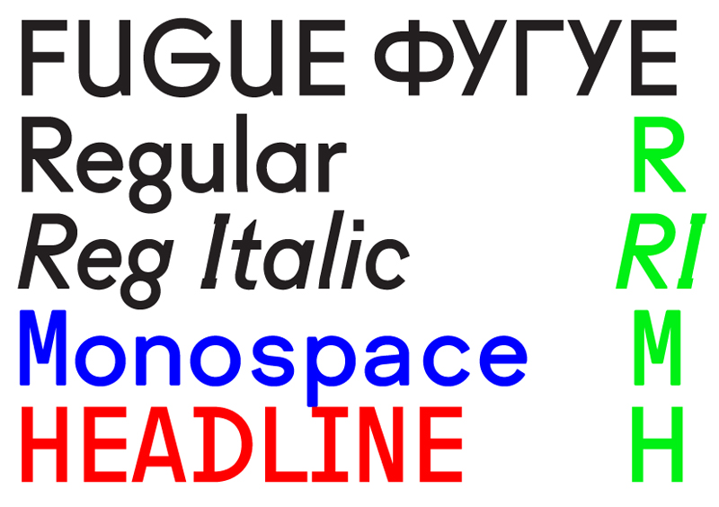
Last year, I chose to use Futura as the font to represent myself as I used it frequently in my work and really thought it represented my practice well. I liked its highly geometric, sleek qualities. I decided to move away from Futura this time around, but still stay true to my passion for sans serif type by using Fugue Regular. This is a more edgy, contemporary typeface that I feel reflects my practice beautifully. Some of my favourite letter-forms in this type family are the upper and lower case g's and the a's. It's angular appearance compliments my logo designs and patterns really well across my updated personal branding/identity.
When the collateral is printed out, it will all be able to fit inside an A4 envelope, which could be distributed very easily to clients, studios, friends and family. I am really pleased that I decided to reassess my personal branding. It was definitely a good decision, because I have definitely progressed and changed as a leaner since first year. Not updating my identity would have been a silly decision, because as a creative, you must adapt and change with the times to prevent your practice from going stagnant. Therefore, as I change as a creative, my personal identity must keep up. I also feel that updating your branding shows that you are excited and engaged about the creative industries that you work in. It prevents you from becoming boring and forgettable as a practitioner.

No comments:
Post a Comment